Color can boost brand recognition by as much as 80%, but only when the color is the right one. Your brand’s name and message do not get conveyed to your customers until they are emotionally engaged with your logo’s colors. The psychology of colors in logo design has a powerful impact on perception, trust, and decision-making within seconds.
The right color can convey a brand’s reliability, vibrancy, opulence, or friendliness without any words involved. Logo color is not just a design element but also a strategic marketing tool. With trends, technology, and consumer behavior changing constantly in 2026, it’s more crucial than ever to know how colors influence emotions and actions.
The guide starts by discussing the psychology behind logo colors, explaining their meanings, and guiding you to select the right color palette for your brand’s values and objectives.
The Role of Color in Human Psychology: How it Affects Emotions and Behavior
Colors have the ability to evoke powerful emotional responses, influencing how we feel and think about a particular brand. This emotional connection plays a crucial role in branding, as it can directly affect consumer behavior and purchasing decisions. The psychological impact of colors is universal, with certain colors triggering similar emotional reactions across cultures, while others can vary depending on context.
For example, warm colors like red and yellow can evoke feelings of energy and excitement, while cool colors like blue and green are often associated with calm and trust. By understanding these psychological effects, you can strategically choose a color that aligns with your brand’s values and the emotions you want to evoke in your audience — an essential consideration when exploring different logo design ideas.
Primary colors like red, blue, and yellow each carry unique psychological meanings, and creating a successful logo depends on choosing the right color combination to communicate the right brand message.
How Each Color Affects Your Logo: A Full-Color Psychology Breakdown
Every color creates a different emotional response and influences how customers perceive your brand. Choosing the right color can strengthen your brand identity, improve recognition, and create a lasting emotional connection with your audience. Below is a complete breakdown of how different logo colors impact branding and consumer psychology.
1. Red: Energy, Passion, and Action

Red is a powerful, attention-grabbing color that is often used in logos to convey energy, passion, and urgency. It’s a color that stimulates the senses, making it ideal for brands that want to evoke strong emotions and prompt immediate action. Whether it’s the excitement of a new product release or the urgency of a limited-time offer, red has the ability to make consumers feel compelled to act quickly.
Brands in industries like food and beverage, retail, and entertainment commonly use red. For example, fast-food chains like McDonald’s and Coca-Cola use red in their logos to encourage appetite and excitement, while sports teams use it to convey power and aggression.
Using red in a logo can help brands stand out and create a sense of urgency, but it should be used carefully. Too much red can be overwhelming or create feelings of aggression, so it’s important to balance it with other colors that soften its intensity.
2. Blue: Trust, Calm, and Professionalism

Blue is often regarded as the color of trust, stability, and professionalism. It is commonly used by businesses in industries like finance, healthcare, and technology, where trust and credibility are key to building customer loyalty. Blue’s calming effect makes it a great choice for brands that want to convey reliability and competence.
Blue is also associated with security and responsibility, which is why it is frequently used by banks, insurance companies, and corporate firms. Brands like IBM, Facebook, and LinkedIn have used blue to establish themselves as leaders in their respective fields, emphasizing their reliability and professional approach.
For a calm and professional feel, blue works exceptionally well. However, different shades of blue can evoke different emotions—darker blues may suggest professionalism, while lighter blues can be seen as more approachable and calming.
3. Green: Growth, Nature, and Sustainability

Green is strongly associated with nature, growth, renewal, and wellness, making it a popular choice for brands that want to highlight sustainability, health, or eco-friendly values. It is widely used in industries such as healthcare, organic food, agriculture, and environmental services because it naturally creates a sense of freshness and balance.
In color psychology, green represents harmony, stability, and rejuvenation. Lighter shades of green often feel calming, refreshing, and connected to wellness, while darker greens convey sophistication, trust, and financial stability. Well-known brands like Starbucks, Whole Foods, and Tropicana use green in their logos to reinforce their focus on health, sustainability, and natural products.
When using green in logo design, the shade you choose matters. Soft and light greens work well for wellness and eco-conscious brands, while deeper greens are ideal for businesses that want to appear reliable, established, and professional.
4. Yellow and Orange: Optimism, Creativity, and Energy

Yellow and orange are vibrant, energetic colors that can create a sense of optimism, warmth, and enthusiasm. These colors are often used to capture attention and evoke feelings of happiness and positivity. Yellow, in particular, is associated with sunshine, joy, and creativity, while orange is seen as energetic, playful, and stimulating.
Yellow and orange are commonly used in logos for brands in industries like entertainment, food, and children’s products. For example, McDonald’s uses yellow to stimulate appetite and convey happiness, while the logo of Fanta uses orange to reflect its fun, youthful energy.
While these colors are effective in creating a friendly and lively vibe, they should be used sparingly. Too much yellow or orange can be overwhelming or cause eye strain, so they are best used in combination with more neutral colors to create balance.
5. Black, White, and Neutral Colors: Sophistication, Simplicity, and Contrast
Black and white logos are timeless, exuding sophistication, elegance, and simplicity. These neutral colors are often used to create minimalist designs that convey a sense of luxury and refinement. Black is also associated with authority and strength, while white represents purity, simplicity, and clarity.
Black, white, and other neutral tones like gray, beige, and ivory are versatile and adaptable, working well with almost any color combination. These colors are especially favored by high-end, luxury brands that want to create a prestigious, refined image.
Using neutral colors in your logo allows for great flexibility, making it suitable for a wide range of applications. For example, Chanel and Apple use black and white to create logos that are simple yet powerful, focusing on elegance and timelessness. Additionally, neutral colors are excellent for creating contrast in combination with bolder, more vibrant colors.
Color Psychology by Industry: Which Colors Work Best for Your Business Type?
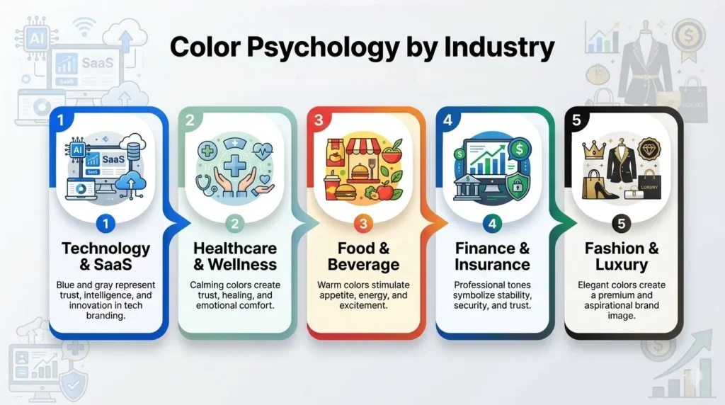
Different industries use specific colors to create trust, emotional appeal, and brand recognition. Understanding industry-specific color psychology helps businesses choose logo colors that align with customer expectations while still standing out from competitors.
- Technology & SaaS: Why: Blue, white, and gray are very popular colors in tech branding as they symbolize trust, intelligence, and reliability. Many startups add a bold accent color to express innovation and creativity while maintaining a clean, professional, and future-ready brand image.
- Healthcare & Wellness: Green, blue, and soft neutral colors are the most suitable for the healthcare and wellness industry. The calming, healing, and trusting nature of these colors ensures that patients feel safe, supported, and emotionally comfortable while receiving medical or wellness care.
- Food & Beverage: They are often used in red, yellow, or orange colors, which stimulate appetite, energy, and excitement. For organic or healthy brands, green is often used to imply freshness, natural ingredients, and well-being.
- Finance & Insurance” The Finance and Insurance sector uses a lot of blue and green, as well as dark grey, branding. The shades symbolize stability, responsibility, and security, traits that are vital in companies dealing with finances, investments, and future financial obligations.
- Fashion & Luxury: Black, white, gold, and deep neutral colors are in fashion and luxury branding. The colors convey luxury, prestige, and enduring refinement, making the brand appear premium, aspirational, and valuable to the consumer.
How to Choose the Right Color Palette for Your Logo: Step-by-Step
Choosing the right logo color palette requires more than personal preference when making a logo. Your colors should reflect your brand personality, connect with your target audience, and remain consistent across digital and print platforms. Follow these essential steps to build a strong and memorable brand identity.
- Step 1: Define Your Brand Personality: First, go through the process of defining your brand values and tone, bold, calm, playful, or premium. The colors you use should evoke a feeling in people’s eyes when they come across your brand.
- Step 2: Knowing Your Target Audience: Colors have different effects on different age groups, cultures, and demographics. Know your target audience’s tastes and preferences so that your colors resonate emotionally and feel relevant to your audience.
- Step 3: Do Your Industry Research.: Research the competition and determine color trends that are being used. Choose a color scheme that is familiar and comfortable for you or one that is different to make a statement.
- Step 4: Select Primary Color: Choose a primary color that will communicate your brand message effectively. This color should be good for both digital and print media and shouldn’t lose impact.
- Step 5: Add Supporting Colors: Balance and add flexibility with 1 or 2 secondary colors. You can use supporting colors to accentuate elements, but not overpower your main brand color.
Cultural Differences in Color Psychology: What Works Globally vs. Locally?
Color meanings vary significantly across cultures. For example:
- In Western cultures, white symbolizes purity and peace.
- In many East Asian cultures, white represents mourning.
- Red symbolizes luck and celebration in China but can signal danger or urgency in Western countries.
- Green holds religious and cultural significance in parts of the Middle East.
Brands operating internationally should research cultural interpretations carefully to avoid negative associations or misunderstandings.
Common Color Psychology Mistakes Brands Make in Logo Design
Many businesses make color-related branding mistakes that reduce logo effectiveness and weaken customer perception. Avoiding these common errors can help create a logo that feels professional, timeless, and emotionally engaging.
- Choosing Colors Based on Personal Taste: Numerous brands choose their logo colors over the interests of the target market. This can result in a lack of impact, brand synergy, and trust, since the colors don’t seem to connect with the target audience.
- Using Too Many Colors: Too many colors in a logo will cause the image to be cluttered and confusing. Complex palettes can result in poor brand recall, poor scalability across platforms, and poor logo appearance on small formats and digital screens.
- Ignoring Cultural Meanings: When brands expand globally, ignoring cultural color meanings can cause misunderstandings or negative reactions. Positive and negative colors can have different meanings in different markets.
- Following Trends Blindly: The world of design is in a constant state of flux. Choosing trendy colors without a long-term brand strategy can make a logo feel outdated quickly, forcing frequent redesigns and weakening brand consistency over time.
Conclusion
Color is one of the most powerful elements in branding and logo creation. It influences perception, builds emotional connections, and improves brand recognition. The psychology of colors in logo design plays a major role in how customers respond to a brand, making strategic color selection far more important than random choices in 2026.
Understanding color meanings, cultural associations, industry trends, and audience preferences helps businesses create logos that instantly communicate their brand story. The right color palette does more than improve visual appeal — it strengthens trust, memorability, and long-term customer connection.