
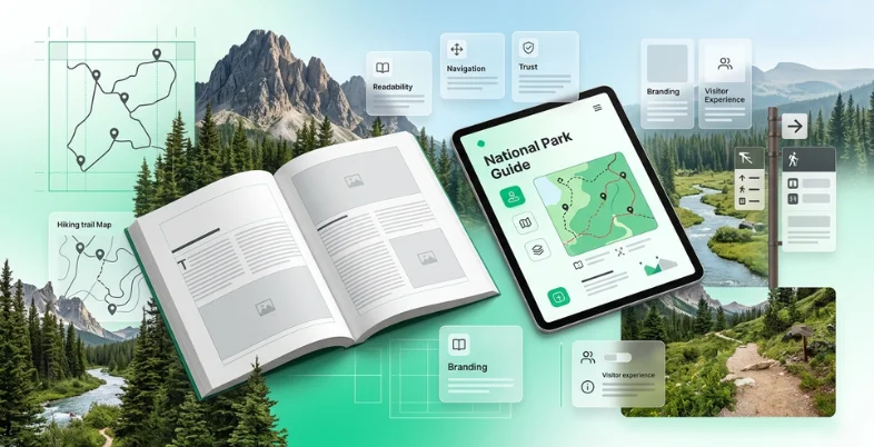
National parks are visual experiences, but the journey often begins with text. A traveler reads a trail guide, checks a campground rule, compares driving routes, scans a safety notice, or looks for a visitor center update before deciding what to do next. In those moments, typography quietly shapes confidence.
For travel publishers, outdoor brands, park-adjacent businesses, and tourism platforms, readable typography is becoming part of the visitor experience. A clear type system helps people plan faster, avoid mistakes, and trust the information they are using. A weak one can make even accurate guidance feel confusing.
This trend connects design with real-world travel. National park content often includes maps, weather notes, permits, fees, warnings, accessibility details, gear recommendations, wildlife advice, and family-friendly itineraries. The font choices behind that information should make the outdoors easier to explore, not harder to understand.
Why Readability Matters in Outdoor Travel Content
Park travelers rarely read in perfect conditions. They may be on a phone in bright sun, planning from a rental car, checking a guide at a campsite, or saving instructions before losing signal. Typography needs to support quick reading and low-stress decisions.
- Make trail names and distances easy to scan;
- Keep safety information visible;
- Separate must-know rules from background storytelling;
- Make dates, fees, and permit details clear;
- Support older travelers and families reading on mobile;
- Keep articles, maps, newsletters, and social posts visually consistent.
| Content Type | Typography Challenge | Better Design Response |
| Trail guide | Distances, elevation, and difficulty must be understood quickly | Clear numerals, short paragraphs, and strong hierarchy |
| Road trip itinerary | Readers compare routes, stops, and time | Scannable headings and consistent labels |
| Safety notice | Users may be stressed or distracted | Plain body text and obvious emphasis |
| Gear review | Specs and prices need comparison | Readable tables and clear captions |
| Family travel post | Parents scan for practical details | Bullets, subheads, and generous spacing |
| Visitor update | Information may change quickly | Simple structure and visible timestamps |
Outdoor Storytelling Needs Structure, Not Just Atmosphere
National park writing often has a strong emotional element: sunrise over canyon walls, forest silence, wildlife encounters, historic sites, and long scenic roads. That atmosphere matters. But travel content also has a practical job. Readers need to know what is safe, what is allowed, where to go, and what to bring.
Good typography helps balance inspiration with utility. A travel article can still feel warm and immersive while making key details easy to find.
| Decorative Travel Design | Useful Travel Typography |
| Large scenic headline only | Headline supported by clear subheads and body text |
| Long paragraphs of atmosphere | Short sections with practical takeaways |
| Tiny captions under photos | Readable captions with location and credit details |
| Mixed fonts for a rustic look | A consistent system that still feels outdoorsy |
| Important warnings hidden in prose | Safety notes separated with visible hierarchy |
Commercial and Custom Fonts Both Have a Role
Not every travel blog, outfitter, lodge, or local tourism brand needs a custom typeface. Many can build a strong identity with a professional commercial font family. Custom typography becomes more useful when a brand grows across many channels or needs a more distinctive voice.
| Font Option | Best For | Main Risk |
| Free fonts | Early blogs, personal guides, simple social posts | Overuse or unclear commercial rights |
| Commercial fonts | Professional websites, guidebooks, newsletters, and ads | Requires budget and license tracking |
| Variable fonts | Responsive websites and digital guide systems | Needs careful implementation |
| Custom fonts | Large travel brands, apps, publishers, and tourism platforms | Higher cost and longer timeline |
Travel teams comparing professional font families, variable fonts, or custom typography software can review foundries such as TypeType when they need type systems that can be tested across websites, apps, guide materials, maps, campaigns, and brand communication.
Real Custom Font Cases with Lessons for Travel Brands
Custom font projects from other industries can still teach useful lessons for travel and outdoor communication. The point is not to copy their style; it is to understand how typography supports consistency at scale.
Dominos Sans for Domino’s Pizza
Domino’s Pizza customized TT Commons™ Pro into Dominos Sans Display and Dominos Sans Text. The relevant lesson is consistency across many touchpoints. A customer may see the same brand voice in packaging, ads, menus, delivery updates, and mobile ordering. Travel brands face a similar challenge across websites, booking pages, trail guides, signage, emails, and social media.
WNTL and Bowtie for Rocket
Rocket uses WNTL, based on TT Commons™ Pro, and Bowtie, based on TT Livret. This pairing shows how typography can balance accessibility and trust. Outdoor and travel content often needs the same balance: clear enough for practical decisions, but warm enough to support storytelling.
SHIFTBRAIN Norms Variable
SHIFTBRAIN Norms Variable, based on TT Norms® Pro, shows how a customized variable font can become part of a digital-first identity. For travel publishers and park-focused platforms, variable typography can support responsive layouts where guides, maps, and recommendations must work across desktop and mobile.
Font Licensing Belongs in the Planning Stage
Font licensing is easy to overlook because fonts feel like creative assets. Legally, however, fonts are software. A license defines where and how the font may be used. A travel brand may use the same typeface on a website, downloadable itinerary, map PDF, mobile app, merchandise, video, or sponsored campaign.
| Use Case | Licensing Question |
| Website | Can the font be embedded as a webfont? |
| Downloadable guide | Can the font be embedded in a PDF? |
| Mobile app | Does the license allow app embedding? |
| Logo or destination mark | Is wordmark use permitted? |
| Merchandise | Can the font appear on products for sale? |
| Video or social ads | Are campaign and motion uses covered? |
| Freelancers | Can files be shared with contributors or agencies? |
Common Licensing Mistakes
- Using a personal-use font in a commercial travel guide;
- Using a desktop license as if it were a webfont license;
- Embedding font files in an app without app rights;
- Sharing font files with contractors without permission;
- Including fonts inside editable templates;
- Modifying letters without checking the EULA;
- Losing license receipts before a redesign.
Typography Mistakes that Weaken Visitor Trust
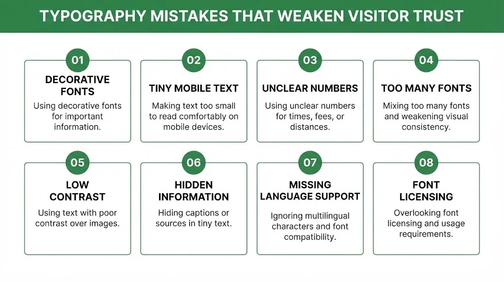
Most typography problems happen when a design is judged only by how it looks in a mockup. Outdoor content has to survive real conditions: sun glare, mobile screens, slow connections, long place names, map labels, emergency notes, and readers who are already tired from travel.
- Using decorative fonts for safety or permit information;
- Making mobile text too small;
- Using unclear numerals for times, miles, fees, or elevations;
- Mixing too many typefaces in one guide;
- Placing low-contrast text over landscape photos;
- Hiding captions or source notes in tiny text;
- Forgetting multilingual characters for place names;
- Treating font licensing as a final detail.
| Better Choice | Why It Helps |
| Readable body font | Supports long planning sessions |
| Clear numerals | Reduces mistakes in distance, time, and fees |
| Consistent captions | Makes photo-led content more credible |
| Simple hierarchy | Helps readers scan routes and warnings |
| Proper license tracking | Reduces publishing and brand risk |
What this Means for Travel Publishers and Outdoor Businesses
| Team or Business | Typography Can Support |
| Travel blog | Readable guides, itineraries, and gear posts |
| Outdoor outfitter | Product specs, ads, packaging, and care labels |
| Tourism board | Destination identity across web, print, and campaigns |
| Campground or lodge | Booking pages, rules, maps, and guest emails |
| App or map platform | Labels, routes, alerts, and offline guides |
| Conservation group | Educational content, reports, and donation pages |
The encouraging part is that typography does not need to become complicated. A simple system with one strong body font, one clear heading style, and consistent spacing can already make a travel resource easier to trust.